20 Perfect Examples of Minimalism in Web Design
March 9, 2011 - 6 CommentsWritten by Emily FoxWhen it comes to website design, sometimes less truly is more. So many sites get bogged down in the details, becoming messy, slow to load, or a pain to navigate. It’s a breath of fresh air to encounter a clean and crisp interface that gives you the facts without the frills. And don’t mistake calm for unassuming: it’s often the most minimal of websites that make the largest impact.
The twenty websites below have mastered the art of minimalist design. They demonstrate that you can still get all of your information across, express your company’s unique character, and make a powerful visual statement even within the simplest and most streamlined of looks.
Astheria
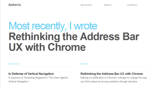
The personal website for a designer’s writing excerpts. A left hand column for articles and right hand column for posts keeps content organized and up-to-date, with the most recent selections appearing first.
Visit Astheria →A Working Library
Organized like a blog and styled in a minimal book-like way. The simple lines separating items are the only real design elements within the page.
Visit A Working Library →Because Studio
Effective example of what large typography and a splash of accent color can do.
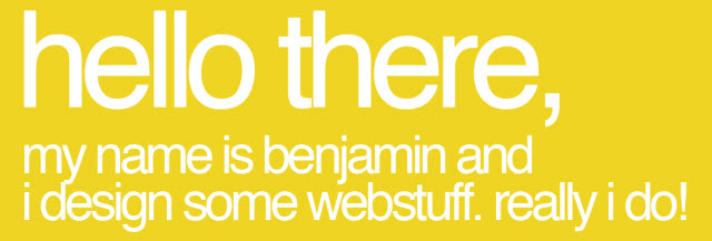
Visit Because Studio →Benny Roth
One bold web page background color is all that’s necessary to grab your attention and carefully balanced out by simple graphics and tasteful writing.
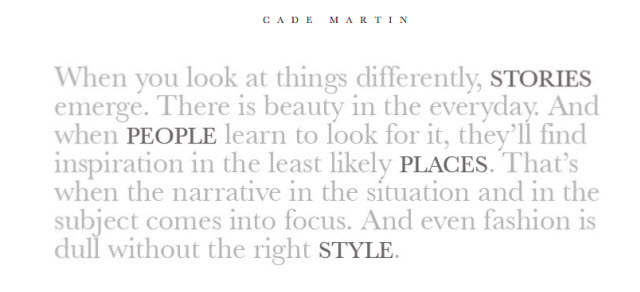
Visit Benny Roth →Cade Martin
Unexpected minimalism: The photography website of Cade Martin, who forgoes images entirely and focuses only on a paragraph of light grey text, so light it almost blends into the background.
Visit Cade Martin →Dan Joe Design
Dan Joe Designs’ signature graphic makes two simple statements: The first, and most important, emphasizes the quality of the designer’s work, and secondly it subtly directs your eye towards the navigation.
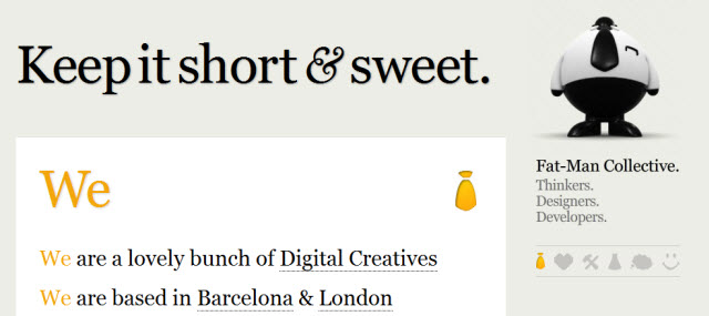
Visit Dan Joe Design →Fat Man Collective
The simple list of company attributes, services and projects is sometimes all that’s needed to put your message across.
Visit Fat Man Collective →Fell Swoop
One circled “clarity” graphic dominates the website, making the point that this is what you’ll achieve through working with Fell Swoop. The circled word theme continues throughout other sections of the site bringing a uniformity to its minimal design.
Visit Fell Swoop →Haikavanian
This artist’s website looks like a blank canvas…that is, until you roll the mouse over the boxes and the empty spaces are filled with images.
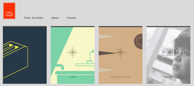
Visit Haikavanian →Kyle Standing
Kyle Standing is a great example of a TumbleBlog that tracks the writer’s contributions over several different social networking services. A minimalist design only serves to highlight the innovating and intriguing idea in itself.
Visit Kyle Standing →Martha Kelly
http://www.marthakelly.com/" onclick="javascript:_gaq.push([" />Reply

Friday, March 11, 2011
20 Perfect Examples of Minimalism in Web Design


Subscribe to:
Post Comments (Atom)
No comments:
Post a Comment