In Inspiration25 Examples of Geometrical Shape Usage in Web Design
Posted by Gisele Muller on Mar 28, 2011 | 6 Comments
I really like the way Wikipedia defines web design: “Web design is a broad term used to encompass the way that content is delivered to an end-user through the World Wide Web…”. And we have to say that web design is really all about the way you deliver content, so taking good care of shaping your website is something that’s very important. Websites are pretty much based on grids and columns, where geometrical forms are the main elements. Here we will show you some examples of how circles, squares, rectangles and triangles are used to better create beautiful and inspiring websites.
Circles
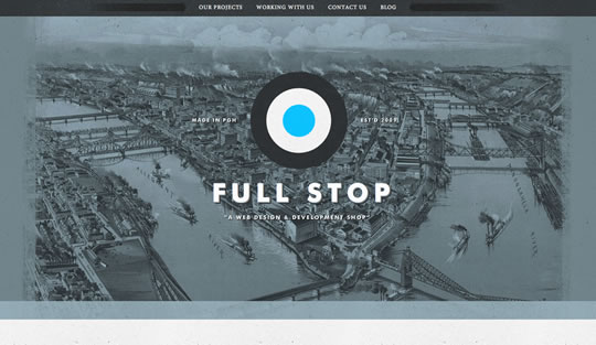
Full Stop
Circles as a big logo getting all the attention to the studio’s name.
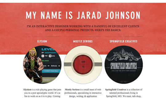
Jarad Johnson
Big circles thumbs to show you a bit of Jarad’s work.
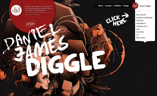
Daniel James Diggle
The logo is a circle and the same circular idea was used in the top left side of the header to draw attention to the artist’s bio.
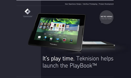
Teknision
Nice circular bubble drawing the attention to the “we’re hiring” part of the site.
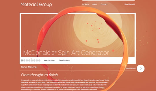
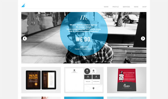
Material Group
Beautiful circular elements all over the page. From foreground and background to navigation buttons.
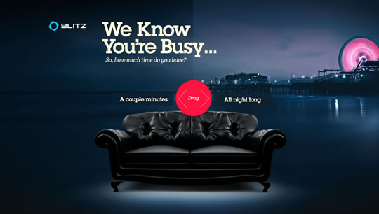
Blitz Agency
Starting here, circular navigations buttons will help you browse their whole content.
Squares
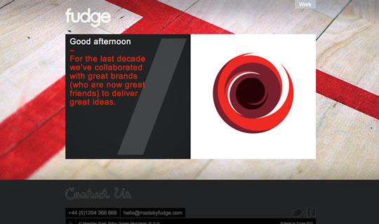
Fudge
Two squares framing the main content.
Francesco Bertelli
Beautiful squared portfolio. Each square guests darker when you hover them.
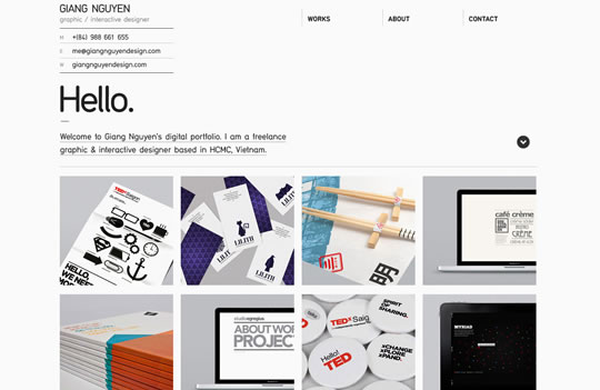
Giang Nguyen
Another good example of squared thumbs to organize content.
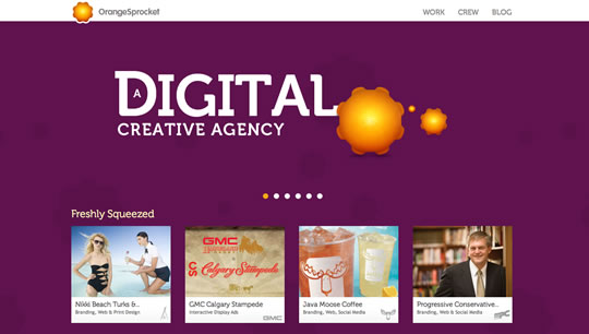
Orange Sprocket
A big background image that changes as you go and squared thumbnails to showcase the agency’s latest work.
Rectangles
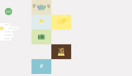
Barnt & Arnst
Several rectangles as thumbnails beautifully colored and designed that help you navigate the website.
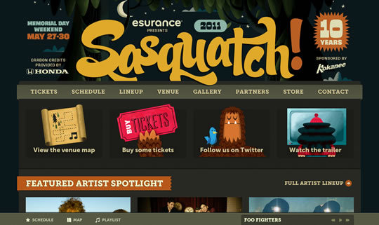
Sasquatch
Different sided rectangles dispose the content in nice illustrated/images thumbs.
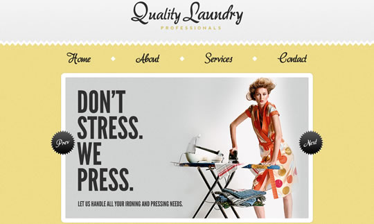
Quality Laundry Professionals
Big framed rectangle showing a nice image, getting the main attention of the page.
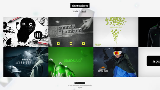
demodern
Rectangles to organize and display content.
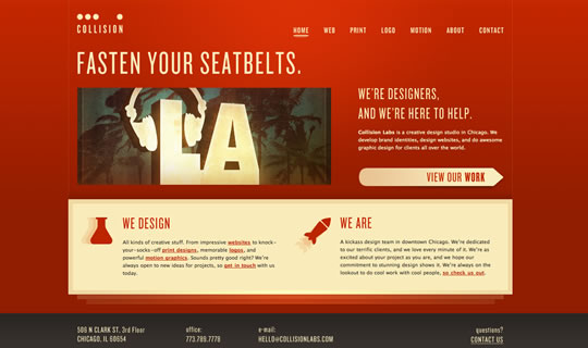
Collision Labs
Different sized rectangles to better organize content.
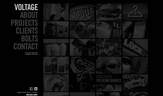
Voltage
Combination of rectangle thumbnails and hover effect to organize the content and create a nice layout.
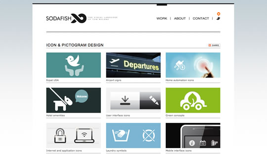
Sodafish
Elegant grid layout based on rectangle thumbnails.
Mixed Shapes
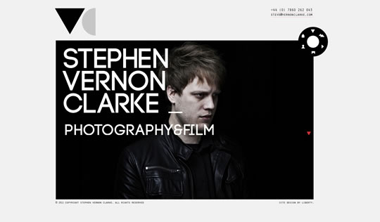
Stephen Vernon Clarke
Here we have a cool mix os shapes. Triangles, semi circles, circles and rectangles creating a nice and clean layout.
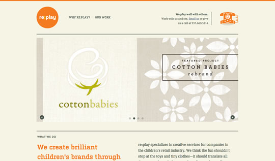
re:play
Circular logo and circular image navigation buttons contrasting with two main content squares.
Brave Nu Digital
A circle inside of a rectangle frame with circular navigation buttons. The content is also beautifully organized in rectangle thumbs.
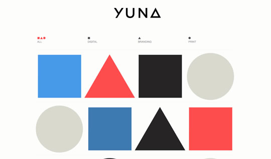
Yuna
Self explanatory

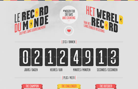
Le Record Du Monde
Circles, squares and nice angled typography… this website is pure geometry.
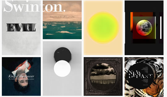
Swinton
Rectangles and squares to beautifully organize and display content.
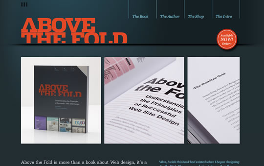
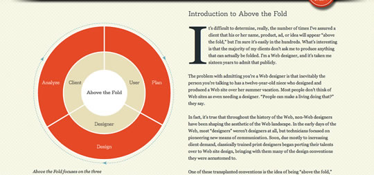
Above the Fold
Nice use of geometrical thumbs to show images of the book. Also using a big circled chart to show important info. The whole layout is really nice actually.
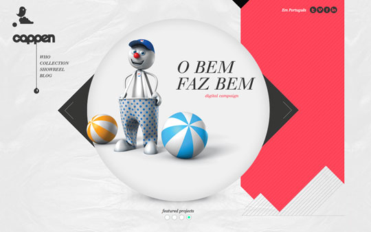
cappen
Circles, triangles and rectangles, there is pretty much going on here and the result is a really nice geometrical layout.
Source:
About the Author

Gisele Muller is someone that recently discovered a new career online. A person that really likes technology, design, photography and creativity. An eternal geek wannabe, tech fan and a communication lover! Current location: Porto Alegre, RS – Brazil. Twitter: @gismullr
Related Posts
Here's some other articles that you will definitely find useful.
30 Excellent Examples of Color Usage in Web Design
30 Fresh Examples of Single Page Websites
30 Examples of Big Backgrounds in Web Design – Round 2
25 Tasty Restaurant and Food Websites to Inspire You
30 Examples of Big Typography in Web Design
Wednesday, March 30, 2011
25 Examples of Geometrical Shape Usage in Web Design


Showcase of 20 Minimalist Grid-Based Web Designs
If you’re been reading SpyreStudios for a while now you probably already know we like minimalist designs. In fact we’ve showcased many websites featuring a minimalist design in the past. We thought it was time for another round.
Minimalism doesn’t rhyme with grid systems, but many grid-based websites will feature a stripped down and clean design and make great use of typography. After all, it’s all about letting the content shine. I hope you enjoy this post!
Nice Device
DBA
Original Championship of Design
Joris Landman
Ben Martineau
Hello Keppa
Pierrick Calvez
Beautiful Explorer
In.somiac
Giang Nyuen
Untitled Studio
Francesco Bertelli
Scribble Tone
Lars Ahrens
Alexandr Schwarz
Futurefabric
IDRAWALLDAY
Derek-Chan
NoirPlus
Republika
Your Turn To Talk
I hope you liked this post. Do you know of some awesome minimalist grid-based web designs that were not featured in this post? Please feel free to share your thoughts by leaving a comment below!


About the author:
Hannah Milan is the founder and curator of MOObileFrames, a collection of wireframes, sketches and UI drawings that focuses on mobile applications. She is also a co-founder of WebdesignerAid, she manages HTML5beauty and SubmitQuickly You can follow her via Twitter at @humbleuidesigns.


