Monday, December 27, 2010

Sunday, December 26, 2010

Saturday, December 25, 2010
Newest Design Trends with Popular CSS3 Techniques
You are here: Home » Coding » Newest Design Trends with Popular CSS3 Techniques
Newest Design Trends with Popular CSS3 Techniques
Posted on 20. Dec, 2010 by Jake Rocheleau in Coding, Design View Comments
With so many new details surrounding the CSS3 release it can be difficult for developers to fully grasp all of the changes. With the evolving nature of the web we’re also seeing great advances in website structures, file formats, units, and even integration with HTML5 attributes. These trends will grow into the greatest iteration of the World Wide Web we’ve ever seen!
Although there is too much material to cover all topics we will be discussing some of the major improvements to CSS3. Many new properties have been introduced which can affect the presentation of a layout in numerous ways. We’re seeing a tightening of regulations with cross-browser compatibility and a greater reach towards mobile operating systems.
If you’d like to learn more about these techniques further than this article feel free to research. Pelfusion has a nice CSS3 tag library full of informative articles and tutorials.
How is the Web Evolving?
Those who choose to stay behind with old HTML standards will not be able to benefit from the rich features available today. Support between browser rendering engines such as WebKit and Gecko has never been better. With Google Chrome, Mozilla Firefox, and Safari running the majority of market share it’s no surprise these standards have adapted so smoothly.
Mobile devices are also catered to nicely. New HTML5 elements allow for wrapping and new styles to be applied based on browser support. Those who have been waiting to advance should start utilizing these new CSS3 benefits today!
Working in CSS3 Media Queries
When CSS2 documentation was drafted it included a section for media types. These raised values such as screen, projection, handheld, and print. This allowed developers to create multiple stylesheets based on which view was being accessed – truly a revolutionary idea.
Media queries behave in a similar fashion but require more specific constituents. These calls can be used to check device properties and see what type of technology your visitors are using. This can include width/height of the current browser, screen resolution, and even orientation for iPhone and iPod Touch devices.
We can see a simple example below for media queries. This code would be run inside a .css file or within style tags in your HTML file.
@media only screen and (max-device-width: 480px) { /* styles here */ }The value 480px is derived from the iPhone’s maximum device width when held in landscape mode. This media query checks to see if the physical device is less than 480px in width. If this resolves true then all CSS code inside will be executed and applied. This can work similar with Android and Blackberry phones as well.
There is also the option to apply media queries simply through external linkage. Below is an example of such an include statement.
link rel="stylesheet" type="text/css" media="only screen and (max-device-width: 480px)"href="small-device.css" />Dynamic Web Gradients
Yes, it is now possible to create background gradients on-the-fly with just CSS markup. Even better the system used to apply these styles follows rules for backup solutions. This helps with browsers which currently don’t support CSS gradients to still show something through a fallback image.
There are also two different major types of gradients called linear and radial. These options will control how your gradient dissolves into the big picture. Linear designs will span from one side to another while radial gradients start from the center and move outward to form a circle.
Generally linear are the easiest to control and will provide the best effects. Below is an example of some CSS code to apply a simple gradient to our heading division.
div.head { background-color: #1a82f7; /* fallback color */ background-image: url('img/bg_1.png') repeat-x; /* fallback image */ background-image: -moz-linear-gradient(100% 100% 90deg, #2F2727, #1a82f7); background-image: -webkit-gradient(linear, 0% 0%, 0% 100%, from(#1a82f7), to(#2F2727)); }Notice how we are using most of the same properties repeatedly with varying values. The first is our very final fallback to a standard flat background color. We then have our fallback image which is in place for browsers not supporting linear gradients.
From here we have a split between Mozilla and WebKit rendering engines. Both gradients created between these functions will look exactly the same and show the same results. For more details on -moz-linear check out Mozilla’s Dev Center while WebKit Gradients have more information in a recent blog post.
Box Shadow Properties
Box shadows are nothing new to web design, though they are very new to CSS3. Since the early days of Adobe Photoshop 7.0 there has always been filters for applying shadows to objects and layers.
Limits are not applied when working with the property in CSS. By this it’s implicit that any element could have a box shadow applied, although it may not look so great being overused. Below is an example piece of code used to apply box shadows in any modern browser.
div.box { box-shadow: 5px 3px 10px 0 #000; }This would apply a smaller black radius to the corner of our
.boxdiv. This property is defined by by 5 separate values which may seem confusing initially but are in reality quite simple.
- horizontal offset of shadow
- vertical offset of shadow
- blur radius which defines how blurry or crisp the shadow will appear
- spread for how far out the shadow will reach
- color of shadow
Box-Sizing
This is one of those hidden gems in the vast landscape of new CSS3 properties. Currently one of the most widely supported specs to be released which allows much greater manipulation potential for the DOM(Document Object Model).
The property itself can be applied to any element since all HTML displays are shaped by the box model. There are 3 possible values to pass in: content-box, border-box, or inherit. Each of the first two options posses new default rendering states for HTML code while the third is a generic inheritance clause from the element’s parent.
*,html,body { box-sizing: content-box | border-box | inherit; }The “classic” way all browsers have rendered elements is through content-box. This ensures all margins and padding applied to the element take place outside of its boundaries. When setting this value to border-box we see just the opposite where all margins, padding, and borders are applied within the element’s width.
This isn’t very noticeable on pages without fixed widths since borders and padding will look exactly the same. However as an example let’s take a 100px box with 5px left/right margins and a 1px border. Using the classic standard we would have a 112px block. However with the border-box value set we would only have a 100px box with 12px internally taken away for the border and margins.
WebKit Supported Transitions
Lucky for those who have been patiently awaiting the arrival of pure CSS transitions. This new property allows for some very radical transitions and neat effects. Below is an example bit of code which is shorthand for transition effects on all paragraphs.
p { opacity: .7; color: #333; -webkit-transition: opacity 1s linear; -webkit-transition: color 1s linear; } p:hover { opacity: 1; color: #000; }The code for -webkit-transition is actually shorthand for describing 3 different properties needed for the transition. In order they are defined by
transition-property,transition-duration, andtransition-timing-function. This type of transformation can be applied to almost any property and can even manipulate multiple properties at once.As an example above we have a paragraph element which has a text color of deep gray and a slightly opened alpha opacity. With both of our transition properties we are declaring a 1 second linear transition from both opacity and color values into the new sets.
This may seem a little confusing at first, and it’s no surprise. It would have taken at least an hour of programming and blocks of JavaScript to replicate this effect nearly 5 years ago. If you still have questions the WebKit blog has a post on animation effects.
These are some of the most notable advances in CSS3. These properties have greatly changed the way we interact with our current web and gives modern web designers plenty of flexibility. Design specs are always updating so it’s important to keep on your toes and move with the changing tides. Stay ahead of current trends and you’ll always be riding on top of the curve in a crowded sea of digital designers.
You might also like:
The Graphic Design Rules of Engagement, Part 1: The PrinciplesFrom Curb to Counter : What the Web Can Learn from this Hotel Brick and Mortar Model?How To Develop CSS3 Border Radius ToolHow To Build Your Reputation And Authority As A DesignerTop 40 Authors Of The Famous Design Blogs7 Design Blogs Of My Friends50 Best Tutorials To Design Wallpapers20+ Web Applications and Tools for Designers44 Amazing Examples of Paper Websites DesignHello there! If you are new here, you might want to subscribe to the RSS feed for updates on this topic.Related Posts:
- Everything You Need to Know about CSS3 Color Techniques
- How To Develop CSS3 Border Radius Tool
- 25 Must Have iPhone Apps for Graphic Designers
- A Comprehensive Guide to Web Terminology
- Black and White vs. Color
- 40 Free Web UI Element Kits and Stencils
- The Fundamentals of Minimalist Web Design
- From Curb to Counter : What the Web Can Learn from this Hotel Brick and Mortar Model?
- Showcase of Dark Designs – Shine And be the Main Focus
- A Guide To Typography On The Web
- 30+ Best Examples of Blog Post Footer Designs
- The Graphic Design Rules of Engagement, Part 1: The Principles
- HTML5 vs. Flash : The Community Has Spoken
- How Much Do Standards And Trends Dictate Your Web Design?
- Using Google to Learn Modern Web Design
Tags: css3, Design, trends, web design
45 Interesting Examples of Big Backgrounds in Web Design10 Extremely Useful Background Generators for DesignersAuthor : Jake Rocheleau
Jake Rocheleau is a social media enthusiast and Internet entrepreneur. He can be followed on twitter - @jakerocheleau His presence on the web can be found at JakeRocheleau.com.


Tuesday, December 21, 2010

Monday, December 20, 2010


Saturday, December 18, 2010
Free Typefaces for Professional Design
http://designmodo.com –We would like to offer you to get acquainted with the following resources offering you to download creative and awesome typefaces for professional design.
Read »
Friday, December 17, 2010


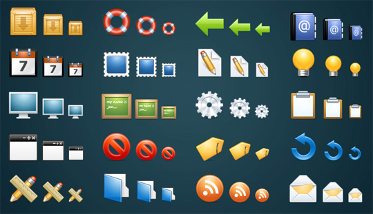
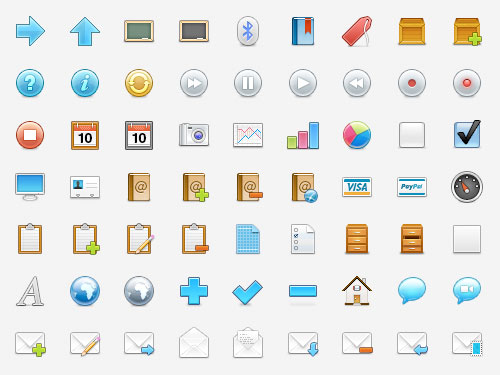
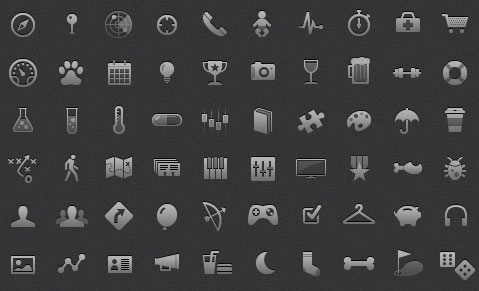
Best Free Icon Sets of 2010
In FreebiesBest Free Icon Sets of 2010
Posted by Henry Jones on Dec 17, 2010 | No Comments
This year is coming to an end, so we’ve been looking back and showing you our picks for the best freebies and resources of 2010. So far we’ve covered fonts, WordPress themes, textures, and jQuery plugins, but for this post, the focus is on free icon set. There were plenty of icons released in 2010, but here’s our our favorites.
Nixus
Vector Social Media Icons
WooCons
Iconic
Project Icons
iconSweets
Sanscons
Default Icon
Social Media Icon Set
Retina Display Icon Set
Glyphish
Related Posts
Here's some other articles that you will definitely find useful.
Best Free Textures and Patterns of 2010
Best jQuery Plugins of 2010
Best Free Fonts of 2010
Best Free WordPress Themes of 2010


Monday, December 13, 2010

Thursday, December 2, 2010
WordPress 3.0.2 Released
In recent news, Toni Schneider announced yesterday at TechCrunch Disrupt that Microsoft’s Live Spaces blogs will be converted over to being powered by the wordpress.com platform over the next six months. That’s 30 million blogs that will be converted over to wordpress.com, adding to the existing 26 million users that wordpress.com already has. What kind …
by Jonathan Dingman on September 28th, 2010 Filed in News

Wednesday, December 1, 2010
7 Best Google Tools For Website Design and Development Project
7 Best Google Tools For Website Design and Development ProjectGoogle has always tried to empower and encourage website designers and developers so that they can build engaging website that can add value to user experience. Over the years, Google has launched different tools and almost all of them are highly effective for building, improving and maintaining website. However, the most interesting thing about them is that they do not come at a price. You need to have a Google account and nothing else if you wish to try these website design and development tools. Here in this article, we have enlisted a list of some of the best Google products that may prove instrumental in designing and developing a website:
Webmaster Tools (google.com/webmasters/tools/home?hl=en)
Of all the Google products, Google Webmaster Tools is the most versatile. It comes with loads of interesting features that can help you analyze website in myriads of ways. You can check whether or not your website has been attacked by virus or malware and you can also pinpoint spider crawl errors. It also offers HTML suggestions and some information on how to speed up the loading time of your website.Google Chrome Developer Tools (blog.chromium.org/2009/06/developer-tools-for-google-chrome.html)
Testing and debugging your website in a web browser is the most convenient and easiest way of ensuring the stability and performance of a website. Being aware of this vital issue, Google Chrome has come up with an all new suite of effective tools that help you inspect different elements of your website meticulously before making it live. Some website developers even argue that this tool works even better than the popular Firebug.Page Speed (code.google.com/speed/page-speed/)
As Google is passing more importance to loading time of a website, website owners are getting cagey about it since the ranking of a website is invariably associated with it. Page Speed is one such tool that lets you speed up your website by trimming redundant things as far as possible. You just need to install this amazing tool in your web browser and it will analyze your website automatically and then will show you the results.Google Code Search (google.com/codesearch)
You are writing a mail function but it is not working somehow. Now, do not bang your head against the table rather do some searches in Google Code Search to find out what is wrong with your written codes. Google Code Search finds out results from different publicly available sample codes and it comes with an advance and intuitive search interface that will let you specify your search queries specifically.Google Website Optimizer (google.com/websiteoptimizer/b/index.html)
Usability of website usually tops the list of concerns of most of the website designers and developers. Now if you are unable to make decide between two different designs, you can get some valuable feedbacks from the users by using Google Website Optimizer. With this powerful tool, you will be able to experiment with your website look and feel by launching A/B testing.Browser Size (browsersize.googlelabs.com/)
You need to check out how your website gets loaded in different web browsers. Browser Size is one such powerful tool that will give you an excellent opportunity to explore how your website renders in different web browsers.Google Analytics (google.com/analytics/)
This is an excellent and the most powerful tool of all Google products that will give you useful statistics about how your website is performing in terms of traffic. Various options are available to analyze traffic source of your website.
Tuesday, November 30, 2010

Sunday, November 21, 2010


Sunday, November 14, 2010


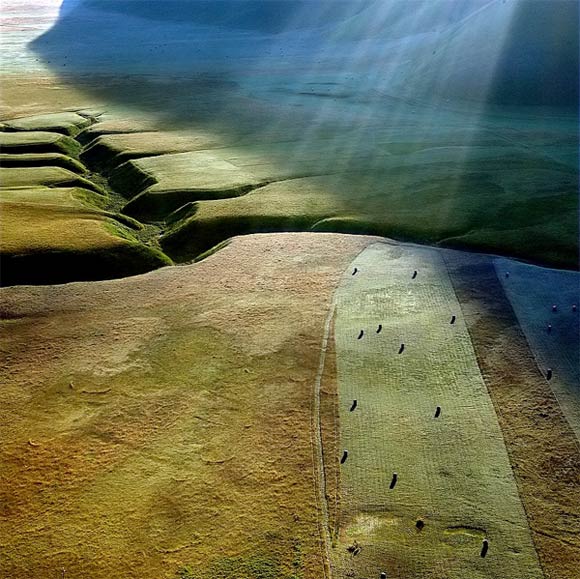
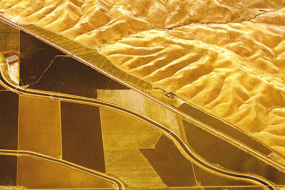
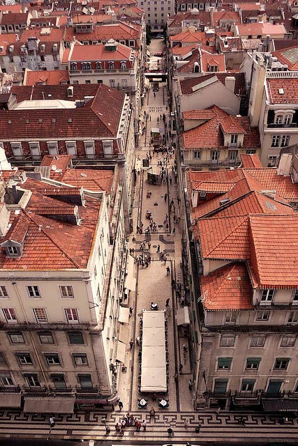
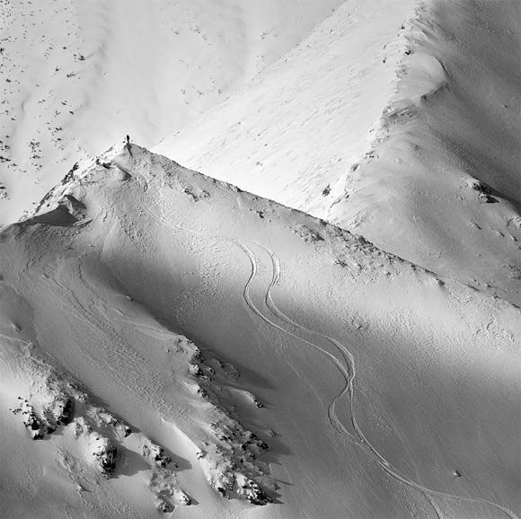
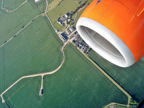
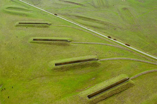
20 Stunning Examples of Aerial Photography
In Inspiration20 Stunning Examples of Aerial Photography
Posted by Henry Jones on Nov 11, 2010 | 6 Comments
Aerial photography has been practiced since the 1800’s when photographers would take to the sky in balloons. And even though cameras and equipment are much better today than they were in the 1800’s, aerial photography is interesting for the same reason it was back then. That is let’s us see our surroundings from a totally new perspective. So to give you some aerial photography inspiration, here are 20 stunning examples.
Related Posts
Here's some other articles that you will definitely find useful.
13 Super Useful Photography Cheat Sheets
20 Breathtaking Examples of Infrared Photography
20 Creative Examples of Forced Perspective Photography
30 Incredible Examples of Macro Photography
21 Creative Examples of Reflective Photography