Tuesday, November 30, 2010

Sunday, November 21, 2010


Sunday, November 14, 2010


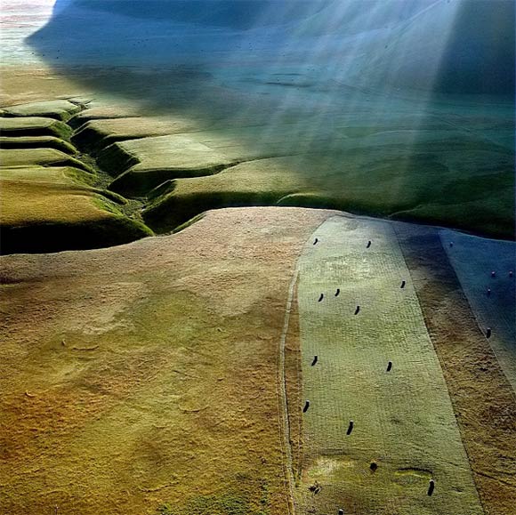
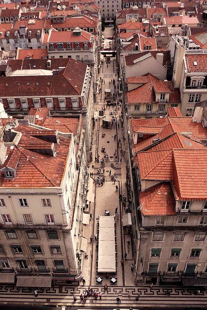
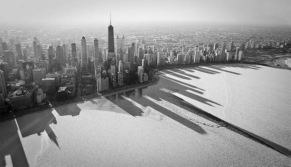
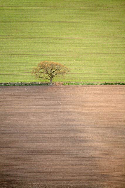
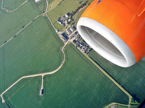
20 Stunning Examples of Aerial Photography
In Inspiration20 Stunning Examples of Aerial Photography
Posted by Henry Jones on Nov 11, 2010 | 6 Comments
Aerial photography has been practiced since the 1800’s when photographers would take to the sky in balloons. And even though cameras and equipment are much better today than they were in the 1800’s, aerial photography is interesting for the same reason it was back then. That is let’s us see our surroundings from a totally new perspective. So to give you some aerial photography inspiration, here are 20 stunning examples.
Related Posts
Here's some other articles that you will definitely find useful.
13 Super Useful Photography Cheat Sheets
20 Breathtaking Examples of Infrared Photography
20 Creative Examples of Forced Perspective Photography
30 Incredible Examples of Macro Photography
21 Creative Examples of Reflective Photography


18 Super Quick Web Typography Tips for Newbies
18 Super Quick Web Typography Tips for Newbies
November 14, 2010 - One CommentWritten by Rebecca WrightCategories → Typography,Web Design
Typography always seems to be an underrated topic when it comes to web designing. In a world where your website becomes your identity, you could either choose to be the elegant, educated prince or the ignorant pauper. And yes, typography can make that difference. The design and the readability of your website is completely dependent on good practice typography. For those newbies to web design, typography predominantly has to do with the very way your website looks and feels – Its not just fonts and font size, there is a lot more to learn.
In this article we have 18 Super Quick Web Typography Tips for Newbies…
You might also like:
21 Typography and Font Web Apps You Can’t Live Without →
50 Essential Web Typography Tutorials, Tips, Guides and Best Practices →1. Emphasize on the Typeface
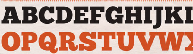
The content remains the primary tool for grabbing the attention of a reader, with the design coming second. As most web designers say, the design will only takes you there; it is the content which impresses people. Although, to add emphasis to the content, it is essential that you to choose the right typeface.
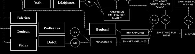
Here is an essential infographic to help: So You Need A Typeface Infographic.2. Using the Grid
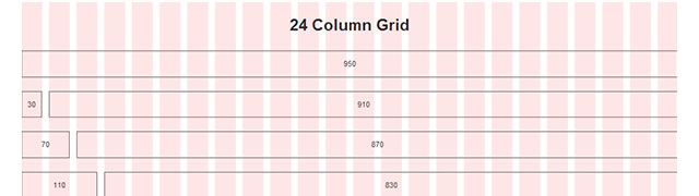
The structure of a website is important for captivating the attention of the user. Simplify your design decisions and give proportion and order to your content by making use of a grid.
There are a multitude of grid resources available, here is a good one to get you started: The Grid System.3. White Space Balance
No one likes a website cluttered with content with very little breathing space for the letters. Leaving some space for margins on all sides of the text is a must; equally vital is the line height. Too little white space tends to frustrate the user, just as too much would as well. Finding a balance is very important.
For an in-depth overview of white-space within web design, you could try this article: Using White Space Effectively In Web Design.4. Size Does Matter
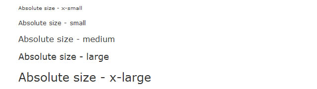
All websites have a hierarchical structure where the headings, the subheadings and the text are of different sizes. Typically, how big should the heading be than the subheading? This is more of a preference than an answer. There are different scales for selecting the size; choose the one which appeals to your website.
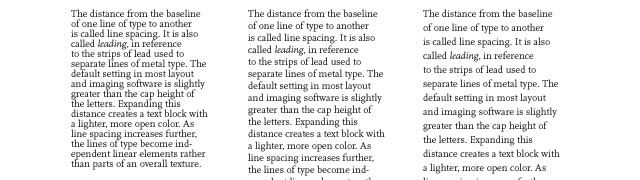
If you are looking for some guidance with your typography scale, try this article: How To Use Size, Scale, And Proportion In Web Design.5. Line Spacing
Line spacing (Leading) dramatically affects the readability of sentences – depending on the font size, type face and other measures, the line spacing should be selected for the best possible display. Typically, a line space of 2 to 5 points more than font size would be perfect for an average website.
Here is a handy resource that helps with line-spacing: Type:Line Spacing.6. Measure
The measure of a web page is basically the width of your text. Too wide requires the person to shift his eyes and neck too much, while too narrow measure requires a lot of scrolling of the screen and the eyes.
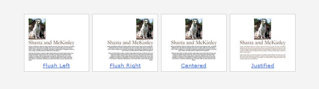
7. Text Alignment
The worst thing you could possibly do to a web page is to justify the content’s text alignment. For one thing, it looks like an elongated spring; another consideration is the readability.8. Font
There is no reason to think that font is not that important just because it appears late in this list; in fact, the font is one of the important considerations in typography. Choose a font that appears clear in all sizes and headings.
Here are 16 Gorgeous Web Safe Fonts To Use With CSS, and for anyone that feels adventurous you could try 25 Completely Free Fonts Perfect for @fontface.9. Single Font per Sentence… at least
If a sentence had different fonts for every word, it would look like a traveling circus and definitely irritate the user. It is better to stick to one font for the entire sentence or for the whole paragraph.
10. Font size
The font size is another primary factor to be considered. While too big a font size requires the user to keep scrolling, smaller font sizes strain the user’s eyes.
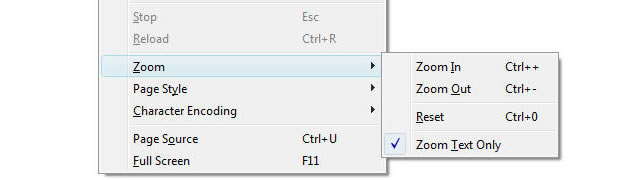
This HTML Font Size Code should give you some guidance.11. Allow for Font Size Increase
Scaling up the font size has proved to be a challenge for every website because of the retention of the content within its given space. Plan your layout in a way that allows font size to be increased.12. Quotation and Apostrophe Marks
Most people don’t realize that while typing in a word processor, it automatically identifies the start and end of a quotation and adds suitable symbols. HTML requires that you use
"for quotations.
For a comprehensive list of HTML special characters, you could try this resource: HTML: Special Characters. And for further reading: Using Proper Quotations and Apostrophes in HTML.13. Limit your Fonts
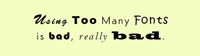
Unless you are designing the website for a specific font creation company, it would be wise to limit the number of fonts you use to only two or three.
Don’t use too many typefaces from Web Design from Scratch or Using too many fonts is bad, real bad.14. Use “–“ instead of “–“
The use of the double hyphen can affect readability; therefore, it is recommended that you use the M-dash or the N-dash instead of the double dash.
Useful reading: What is the Difference Between an Em Dash and an En Dash?15. Serif for Headlines and Sans-Serif for the Body
Serif fonts are the accented fonts and look amazing on the headlines, while sans-serif offer more readability even if the font size is smaller – hence, they can be used for the body.
Serif vs. sans-serif legibility16. Ellipsis
The ellipsis symbol is used to denote omission or continuation. In order to be precise, the actual ellipsis should be used instead of using three periods – (…). (HTML: Special Characters).17. Shoot Properly
Bullets are one of the factors that can improve the look of the content. If the bullets are within the paragraph, it would look sloppy; therefore, bullets have to be indented separately.
This tutorial will shows you how to make your lists stand out: Making Lists Look Nicer with CSS.18. Color
The color of the font is of primary significance since colors highlight the content. Use of contrasting colors is advisable; also a menagerie of colors could ruin the effect.
You might also like…
21 Typography and Font Web Apps You Can’t Live Without →
50 Essential Web Typography Tutorials, Tips, Guides and Best Practices →
The Classification of Fonts →
Typography as Art →
Five Alternative Methods for Typography Inspiration →
45 Creative Examples of Typography in the Wild →
50 Examples of Effective Uses of Typography Within Web Design →
A Showcase of 35 Beautiful Typographical Illustrations →
45 Stylish and Creative Typographical Desktop Wallpapers →About the Author: Rebecca Wright (2 Articles)
Rebecca Wright is a 34-year-old native of Florida. She has a knack for details on web hosting and anything about it. She works full time as a Senior Web Copywriter for one of the country’s leading web hosting company.
One Comments (Leave yours)
Due to English not my main Language I face alot of problem to write very quality articles
The info mentioned in this article will help me alot in my Typography journeyMany Thanks
Leave a Comment
Leave a Reply
Leave a Comment
Trackbacks