Monday, October 25, 2010
The Complete WordPress-as-a-CMS Guide
Design Shack - Web design showcase, CSS tutorials and web standards
About
Design Shack showcases inspiring web design, alongside resources and tutorials for you to succeed in the same way. It is carefully curated and edited by Josh Johnson and David Appleyard.


Sunday, October 24, 2010
CSS3 Cookbook: 7 Super Easy CSS Recipes to Copy and Paste
CSS3 Cookbook: 7 Super Easy CSS Recipes to Copy and Paste
Written by Joshua Johnson, On 20th October 2010.
Filed in CSS.
By now you’ve probably seen enough lengthy CSS3 tutorials to last a lifetime. You’re probably starting to become familiar with what CSS3 has to offer and are ready to move past basic theory and see some practical design examples that you can copy and paste right into your code without without wading through tons of commentary.
Well you’re in luck because that’s exactly what we have for you today! Below you’ll find seven fun and attractive CSS tricks that you can grab and insert right into your own projects and customize at will. Keep in mind that since this stuff is still cutting edge, older browsers won’t support most of it. I’ve tried to ensure graceful degradation where possible so that you can provide a working experience to all users and a better experience to those with using webkit.
Like the article? Be sure to subscribe to our RSS feed and follow us on Twitter to stay up on recent content.Letterpress
Insetting text is fairly simple in CSS. To accomplish it you’ll need three colors: one background color, a lighter shade of the background color and a darker shade of the background color.
To start off, fill your text with the darker shade of your background color. Then simply apply a CSS3 text shadow that’s a lighter shade and it has the effect of creating an embossed look.
The HTML
<body> <div id="container"> <p>pressed</p> </div> </body>The CSS
body { background: #222222; color: #131313; font-size: 200px; } #container p { text-align: center; text-transform: uppercase; text-shadow: #2c2c2c 3px 3px 5px; }Small Caps
The small caps effect is when all of the letters in a headline are capital, but the initial letters in each word are larger than the rest. It’s a nice and simple effect that you don’t often see on the web (not really CSS3 but still cool!).
One easy way to do this is simply to insert “small” tags into your HTML and then to style those tags with a slightly smaller font size than the rest of the headline.A few commenters informed me that there is in fact an easier way to accomplish this! Simply use “font-variant: small-caps;” and you’re good to go!I also used the “uppercase” text-trasform just for fun. This will automatically take any lowercase text and transform it, making it easy to go back and change your HTML while keeping the same look, even if you don’t remember to type in all caps.
The HTML
<body> <div id="container"> <p>Small Caps</p> </div> </body>The CSS
body { background: #2c2b2b; color: #131313; font-size: 200px; } #container p { text-align: center; text-transform: uppercase; text-shadow: #363535 3px 3px 5px; font-variant: small-caps; }CSS Coupon
This one is helpful for those online retailers that want to offer promotions, sales, online coupons, etc. The typical border treatment that you see on most websites is just a solid line, but you can alternatively apple dashed or dotted lines to a border.
Combine this with some CSS3 rounded corners and a box-shadow and you’ve got yourself a nice little CSS coupon graphic!
The HTML
<body> <div id="container"> <h2>$10 Off</h2> </div> </body>The CSS
body { background: #21303b; color: #000; } h2 { font-size: 80px; line-height: 70px; font-family: Helvetica, sans-serif; font-weight: bold; text-align: center; text-transform: uppercase; } #container { background-color: white; height: 200px; width: 400px; margin: 100px auto; border: 3px dashed #21303b; /*shadow*/ -webkit-box-shadow: 10px 10px 10px #000; -moz-box-shadow: 10px 10px 10px #000; box-shadow: 10px 10px 10px #000; /*rounded corners*/ -webkit-border-radius: 20px; -moz-border-radius: 20px; border-radius: 20px; }Stitched
While we’re on the subject of dashed border treatments, here’s an alternate trick you can use to give a box a subtle sewn-on illusion.
This time instead of a border we use an outline. An outline can be easily inset using a negative value on the outline-offset command.
The HTML
<body> <div id="container"> <h2>Stitched</h2> </div> </body>The CSS
body { background: #21303b; color: #fff; } h2 { font-size: 70px; line-height: 190px; font-family: Helvetica, sans-serif; font-weight: bold; text-align: center; } #container { /*stitching*/ outline: 1px dashed #98abb9; outline-offset: -5px; background-color: #556068; height: 200px; width: 400px; margin: 100px auto; /*shadow*/ -webkit-box-shadow: 2px 2px 2px #000; -moz-box-shadow: 2px 2px 2px #000; box-shadow: 2px 2px 2px #000; }Gloss
This popular and perhaps overused web 2.0 effect used to require at least one image to pull off. Now using CSS3 and a little background gradient know how you can recreate that shine using only code.
Complex CSS gradients can be hard to build so I recommend utilizing the Ultimate CSS Gradient Generator or something similar to help automate the process.
The HTML
<body> <div id="container"> <h2>Gloss</h2> </div> </body>The CSS
body { background: #21303b; color: #fff; } h2 { font-size: 120px; line-height: 190px; font-family: Helvetica, sans-serif; font-weight: bold; text-align: center; text-shadow: rgba(0, 0, 0, .3) 5px 5px 5px; } #container { /*gradient*/ background: #666666; /* old browsers */ background: -moz-linear-gradient(top, #666666 4%, #545454 50%, #3A3A3A 51%, #131313 100%); /* firefox */ background: -webkit-gradient(linear, left top, left bottom, color-stop(4%,#666666), color-stop(50%,#545454), color-stop(51%,#3A3A3A), color-stop(100%,#131313)); /* webkit */ filter: progid:DXImageTransform.Microsoft.gradient( startColorstr='#666666', endColorstr='#131313',GradientType=0 ); /* ie */ /*box styles*/ height: 200px; width: 400px; margin: 100px auto; /*shadow*/ -webkit-box-shadow: 5px 5px 5px rgba(0, 0, 0, .3); -moz-box-shadow: 5px 5px 5px rgba(0, 0, 0, .3); box-shadow: 5px 5px 5px rgba(0, 0, 0, .3); /*corners*/ -webkit-border-radius: 50px; -moz-border-radius: 50px; border-radius: 50px; }Stroked Text & @font-face
In this example you get two tricks in one! You’ll see the syntax for adding text strokes in webkit plus that for adding custom fonts in all modern browsers using @font-face.
The font I used in the example below is called Jungle Fever and can be downloaded as an @font-face kit from Font Squirrel.
The HTML
<body> <div id="container"> <h2>Jurassic</h2> </div> </body>The CSS
/*Fonts*/ @font-face { font-family: 'JungleFeverRegular'; src: url('JungleFever-webfont.eot'); src: local('☺'), url('JungleFever-webfont.woff') format('woff'), url('JungleFever-webfont.ttf') format('truetype'), url('JungleFever-webfont.svg#webfontBlD2f3Gz') format('svg'); font-weight: normal; font-style: normal; } body { background: #222; color: #111; } h2 { font-size: 150px; line-height: 200px; font-family: 'JungleFeverRegular', Helvetica, sans-serif; font-weight: bold; text-align: center; text-shadow: rgba(0, 0, 0, .2) 3px 3px 3px; /*text stroke*/ -webkit-text-stroke: 2px #fff473; }Double Stroked Text
I discovered this tip completely by accident while building some stroked text for the previous example. It turns out if you use RGBa on stroked text and bring down the opacity a bit, you can achieve an awesome double stroke! I’m not entirely sure why it works (something to do with the bleed of the stroke?) but it does!
The HTML
<body> <div id="container"> <h2>Lobster</h2> </div> </body>The CSS
/*Fonts*/ @font-face { font-family: 'Lobster13Regular'; src: url('Lobster_1.3-webfont.eot'); src: local('☺'), url('Lobster_1.3-webfont.woff') format('woff'), url('Lobster_1.3-webfont.ttf') format('truetype'), url('Lobster_1.3-webfont.svg#webfontcOtP3oQb') format('svg'); font-weight: normal; font-style: normal; } body { background: #731e1e; color: #fff; } h2 { font-size: 220px; line-height: 220px; font-family: 'Lobster13Regular', Helvetica, sans-serif; font-weight: bold; text-align: center; text-shadow: rgba(0, 0, 0, .2) 3px 3px 3px; /*text stroke*/ -webkit-text-stroke: 4px rgba(0, 0, 0, .6); }Conclusion
As I said in the opening statements, feel free to copy and use the examples above however you wish. Leave a comment below if you have any ideas for improving any of these tricks, whether it’s making them look cooler or more cross-browser friendly. They’re far from perfect and I want to see you make them better!


Saturday, October 23, 2010


Friday, October 22, 2010


10 Fresh jQuery Plugins and Tutorials
10 Fresh jQuery Plugins and Tutorials
The popularity of jQuery continues to grow. This means that we’re seeing it used on more websites these days, and there are more developers coming up with new ways to use it. The great thing about that is many of these developers are sharing what they learn though tutorials and plugins. We’re always on the look out for this new jQuery stuff. So for this post, I’ve gathered 10 tutorials and plugins that will help you learn and implement some fresh jQuery effects in your projects.
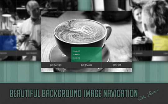
Beautiful Background Image Navigation
This tutorial will teach you how to create a beautiful navigation that has a background image slide effect. The main idea is to have three list items that contain the same background image but with a different position.
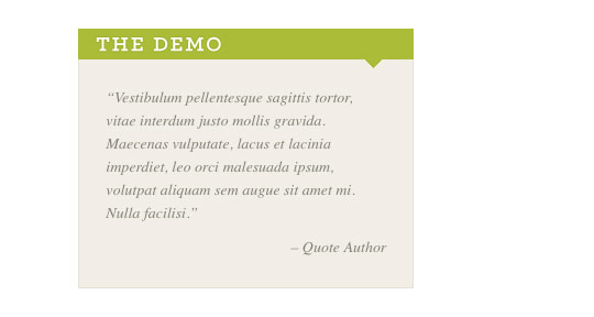
Quovolver
Quovolver is a simple extension for jQuery that takes a group of quotes and displays them on your page in an elegant way.
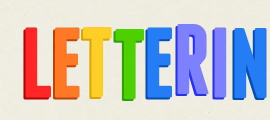
Lettering.js
Lettering.js is a lightweight, easy to use jQuery plugin for radical Web Typography.
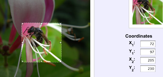
imgAreaSelect
imgAreaSelect is a plugin for selecting a rectangular area of an image. It allows web developers to easily implement image cropping functionality, as well as other user interface features, such as photo notes (like those on Flickr).
An HTML5 Slideshow w/ Canvas & jQuery
This tutorial will help you create a progressively enhanced slideshow with a fancy transitioning effect, which is perfectly functional in older browsers as well.
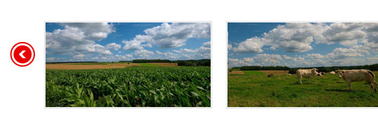
Tiny Carousel
Tiny Carousel is a lightweight carousel for sliding html based content. It was built using the javascript jQuery library. Tiny Carousel was designed to be a dynamic lightweight utility that gives webdesigners a powerfull way of enhancing a websites user interface.
jQuery Panel Gallery 2.0
jQuery Panel Gallery is a plugin that converts a set of images into a slideshow with fancy transitions.
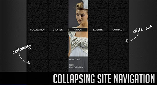
Collapsing Site Navigation
Learn how to create a collapsing menu that contains vertical navigation bars and a slide out content area.
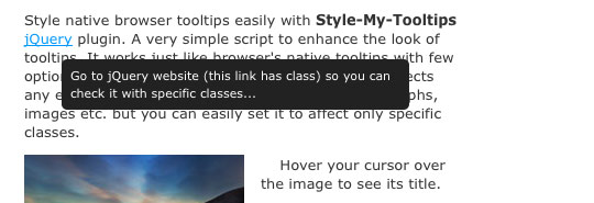
Style my Tooltips
Style my Tooltips is a simple jQuery plugin to better style native browser tooltips.
jQuery Mega Select List
The jQuery Mega Select List is a plugin that converts a long select-list into a mega-menu style display, which makes it easier to find and select the right option.
Related Posts
Here's some other articles that you will definitely find useful.
11 Useful jQuery Tab Navigation Solutions
19 Unique jQuery Tutorials for Web Developers
10 Fresh and Useful jQuery Plugins
10 jQuery Slider Techniques and Plugins
10 jQuery Plugins and Techniques for Doing More with Images


10 Excellent WordPress Themes for Portfolios and Galleries
10 Excellent WordPress Themes for Portfolios and Galleries
Themes can extend WordPress into much more than just a blogging platform, and it’s common for theme developers to create themes with a focus on specific niches. For example, a few weeks ago we posted a collection of business WordPress themes that were aimed at giving business owners an easy way to get a great looking site online. So for this post, the focus is on portfolios and galleries. We’ve rounded up 10 themes that are ideal for designers and photographers who don’t have web design skills to build their own portfolio site. The themes we selected for this post are well designed and do an excellent job of presenting the content in a professional manner.
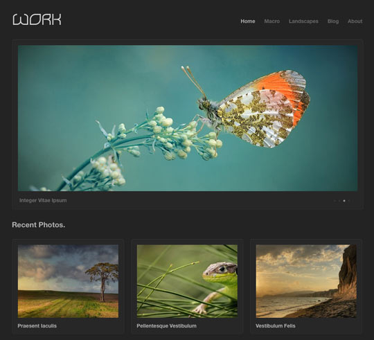
Work
Work is an elegant portfolio theme built for showing off your work. This theme has a clean and professional style that is perfect for displaying anything from illustrations to photography. Easily build your portfolio with the numerous built-in page templates that give you the ability to create one, two, three, and four column gallery layouts.
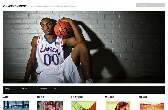
On Assignment
On Assignment is primed for photographers, videographers and journalists who need to feature their portfolio and connect with followers and potential clients with status updates and news/blog posts.
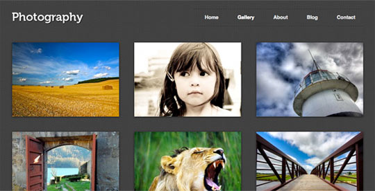
Photography
Photography is a theme built for photographers. Includes easy to use galleries, integrated Flickr support, and two gorgeous color schemes.
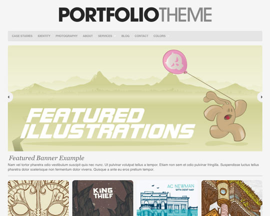
Portfolio
The Organic Portfolio Theme offers a clean, professional way of displaying artwork, design, photography and more. The theme features a portfolio category template that allows for 1, 2 or 3 column layout, a featured content slider, additional portfolio page templates and an options page for easily changing the content of the home page.
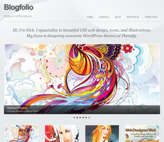
Blogfolio
Blogfolio is an advance theme that provides unique layout options to display your portfolio and blog posts. It is designed to give maximum space to display your work.
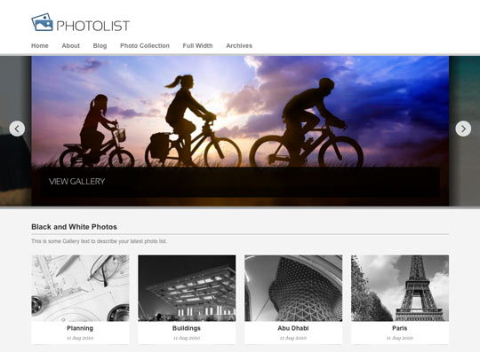
Photolist
A minimalist theme for Photographers and bloggers alike with features such as image filters and a unique gallery slider.
Widescreen
Widescreen is a photography theme for WordPress that features multiple homepage layout and design options including a fullscreen slideshow, a homepage video, featured posts and much more.
deLucide
deLucide is a very sleek and elegant portfolio theme to showcase your photos or any other work in a professional and lucent design.
DeepFocus
DeepFocus lets you turn your WordPress blog into a fully functional online photo gallery while still maintaining all of the features of a normal blog. Along with the gallery layout, DeepFocus comes with a robust blog and CMS-style homepage as well, making it an amazing solution for artists/photographers looking to build an online presence.
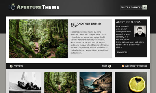
Aperture
Aperture is a multi-functional photo-blogging theme with a unique home page, consisting of a latest posts slider, a visual category display, a blog module and lots of stylish widgetized spaces.
Disclaimer: The Work theme is a product of Theme Trust, which is founded by Henry Jones, who is also founder of Web Design Ledger.
Related Posts
Here's some other articles that you will definitely find useful.
10 Professional WordPress Themes for Business Websites
10 Free Clean and Minimal WordPress Themes
WordPress 3.0: Changing The Way We Manage Content
20 Best WordPress Ecommerce Themes
10 Best Free Minimal WordPress Themes